
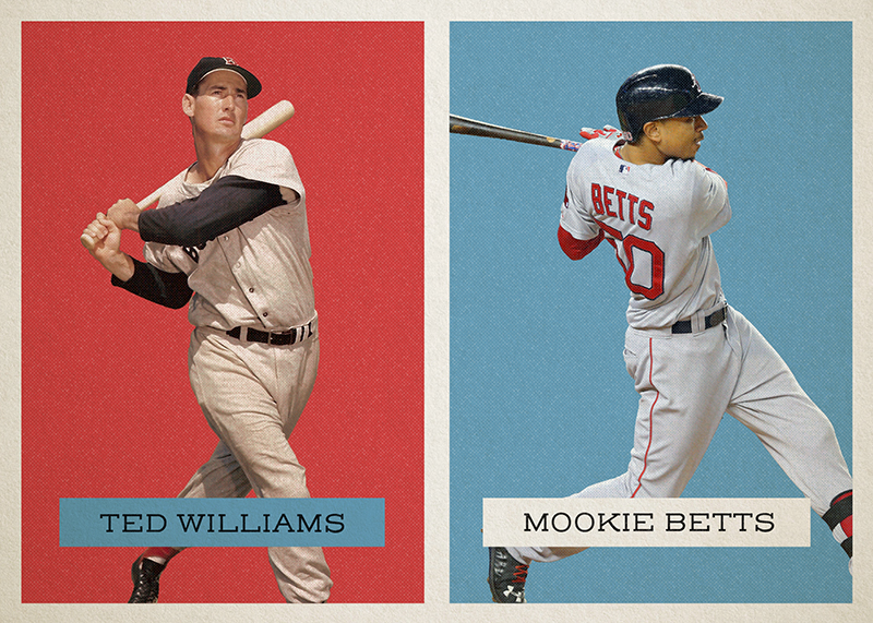
The inspiration behind this one was classic monotone posters from the 40's and 50's. I wanted to contrast vintage players with modern ones, and thought the red and blue played off each other nicely, especially paired with some retro inspired type.

The inspiration behind this one was classic monotone posters from the 40's and 50's. I wanted to contrast vintage players with modern ones, and thought the red and blue played off each other nicely, especially paired with some retro inspired type.

A local law firm brought me on as their Director of Web Operations. I am in charge of everything web based, including...
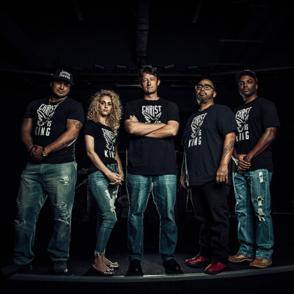
A Christian musical group approached me about album photography and website needs. We were able to scout a location...

With the start of the 2023 baseball season just a few days away, I wanted something to commemorate that "Opening Day...
0 Comments