2017 Heritage

Written by Matt

October 26, 2022

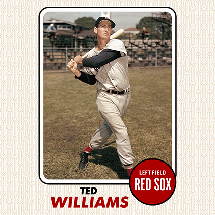
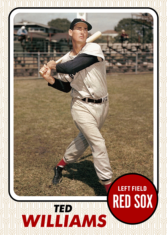
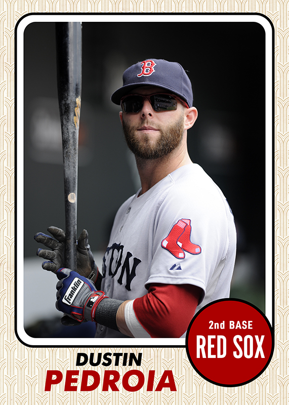
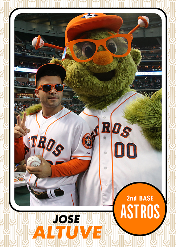
Every year Topps Heritage looks back at classic designs and recreates them. That’s, literally, what I do as a hobby so it only makes sense that I’d do a homage to a homage. 2017 Heritage looks back at 1968. The problem with 1968 Topps is that it used this very harsh “burlap” texture on the cards, in combination with seemingly random accent colors. I figured I could replace that texture with a more art deco pattern, and bring accurate team colors back into the mix.

Super Short Print Photo Variation – just for fun

Continue reading…

Law Office

Law Office

A local law firm brought me on as their Director of Web Operations. I am in charge of everything web based, including…

Band Photography

Band Photography

A Christian musical group approached me about album photography and website needs. We were able to scout a location…

Home Series

Home Series

With the start of the 2023 baseball season just a few days away, I wanted something to commemorate that “Opening…

0 Comments

Submit a Comment

Your email address will not be published. Required fields are marked *